Project role: Strategist, Designer
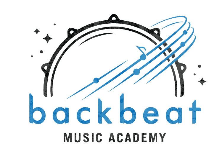
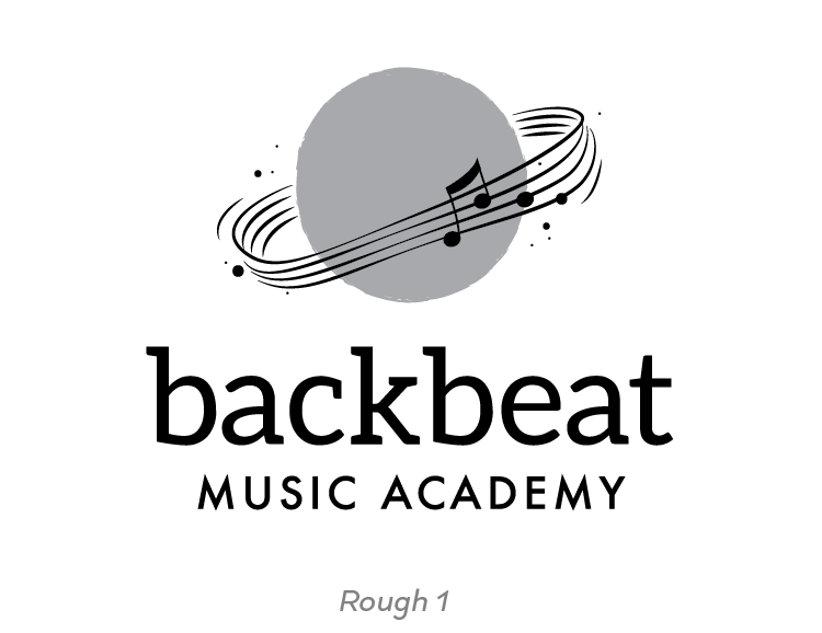
When we were collaborating in brainstorming on this design, John made it clear he wanted something that was friendly, would appeal to all ages, and clearly read "music" and "rock" without being tacky or obvious. The final logo features a custom word mark that hails back to 80's rock, but with a much friendlier edge. The symbol takes a simplified drum shape and makes it planetary with rings made out of a music staff.
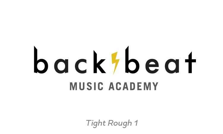
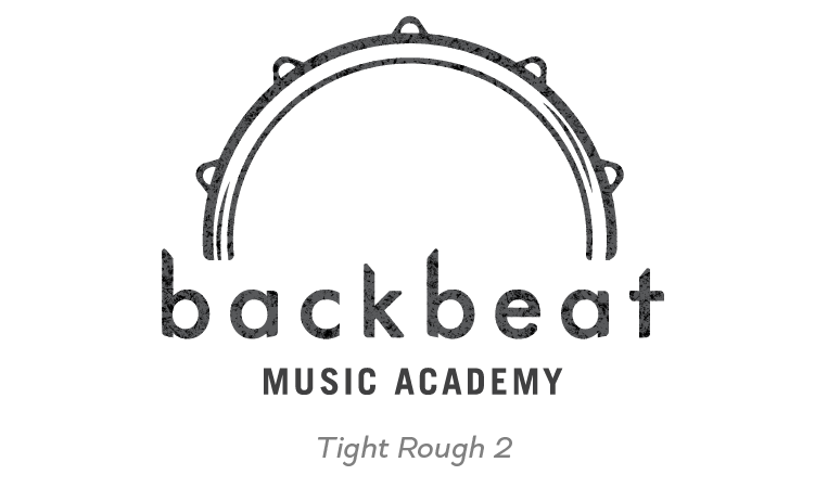
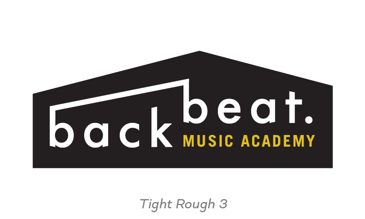
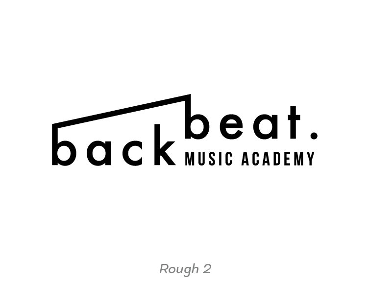
(Above) These three rough logos made it to the final round of revisions. The final is a refined hybrid of Tight Rough 2 and the planet concept in Rough 1, below.
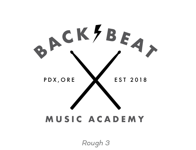
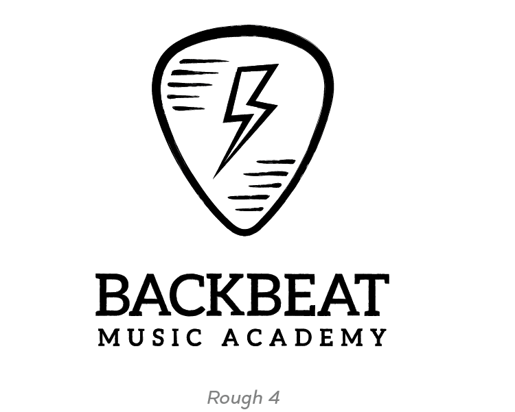
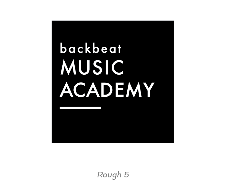
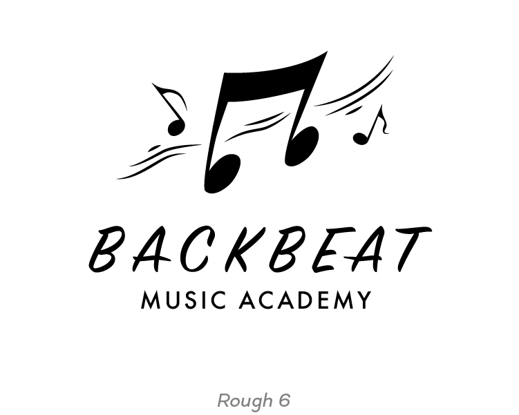
(Above) Ranging from whimsical to modern to vintage rock, these 6 digital roughs were the result of my first round of revisions.
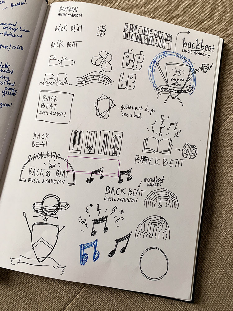
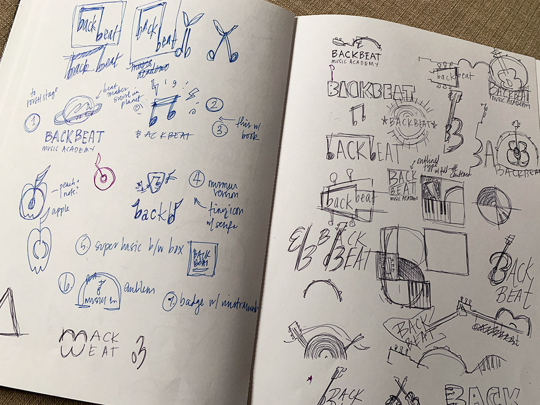
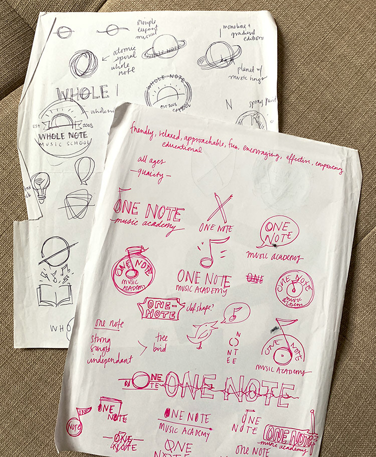
(Above) In these initial sketchbook brainstorming sessions, I played around with whatever came into my mind. Before the school had an official name, John was playing around with variations of "Whole Note", so I started by playing around with that concept.